Background
Lumen Technologies: Lumen Technologies, known for its extensive telecommunications and technology services, operates notable brands such as CenturyLink and Quantum Fiber. These brands specialize in providing high-speed internet services to residential and business customers across the United States.
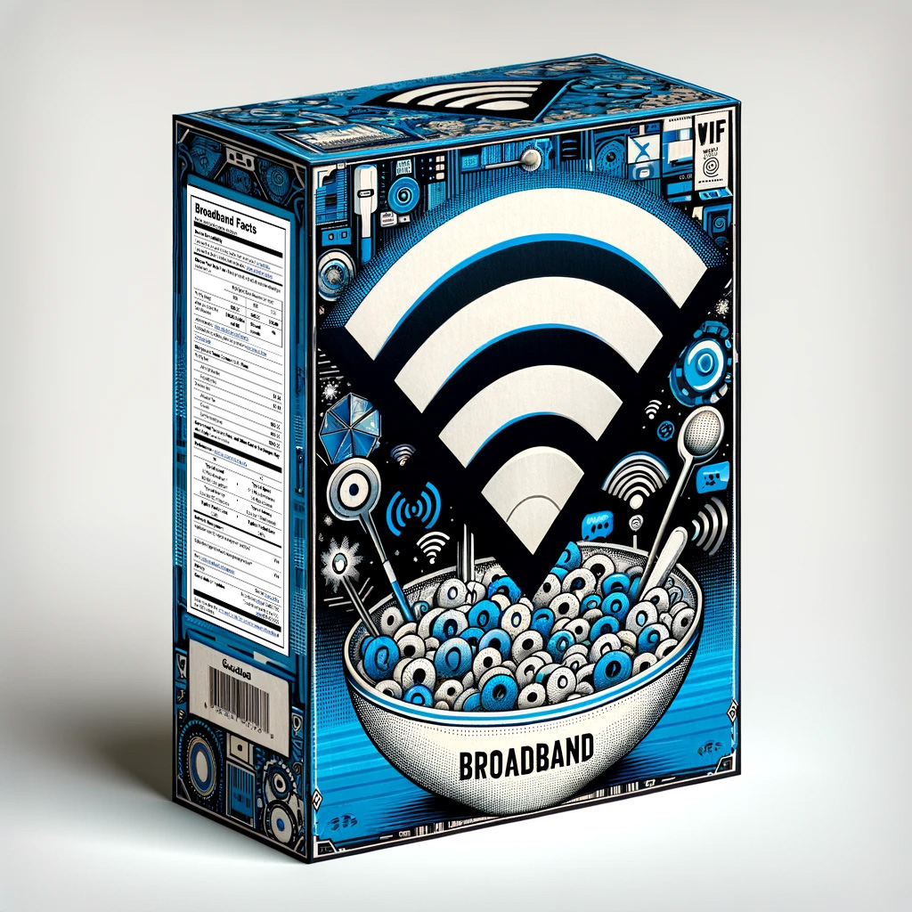
Broadband Nutrition Label (BBNL): The Federal Communications Commission (FCC) mandated the Broadband Nutrition Label as part of its efforts to ensure transparency and fairness in the broadband market. This requirement, akin to nutritional labeling on food products, compels telecom companies to present critical service information—such as speeds, fees, and data allowances—clearly and prominently on all sales and promotional materials. This initiative aims to empower consumers with straightforward information, enabling them to make well-informed choices regarding their internet service providers.
The Problem
When implementing the broadband nutrition label, there were a multitude of problems that needed to be addressed.
1. Federal Compliance Deadline
The Broadband Nutrition Label (BBNL) was a federal mandate requiring immediate attention due to its firm implementation deadline of the end of 2023. This tight timeline necessitated swift action to integrate the label across all applicable platforms, ensuring that Lumen Technologies complied with legal standards while continuing to provide uninterrupted service.
2. Prominence of Display
A key requirement of the BBNL mandate was that the label must be prominently displayed, making it impossible to relegate to less visible sections of sales and informational materials. This presented a significant challenge in integrating the label into existing website designs and layouts without disrupting the established user interface and customer experience.
3. Complexity of Legal Requirements
The label was required to display multiple legal details, including pricing, data allowances, and fees in a transparent and easily understandable format. Each piece of information had to meet specific standards for clarity and accuracy, adding complexity to the design and implementation process.
4. Variability of Service Offerings
Lumen’s provision of numerous internet speed packages and bundles, which vary by ZIP code and time of year, added another layer of complexity. The BBNL needed to dynamically reflect accurate and relevant information for a diverse range of products and services, which required sophisticated backend solutions to pull and display the correct data in real time
Challenges
Design Challenges
The primary design challenge was aligning the BBNL’s visibility and clarity requirements with existing website layouts and user interfaces. The mandate stipulated that the label could not be hidden or obfuscated, requiring a redesign of many interface elements to ensure compliance. I led three design ideation workshops—two with the UX team and one involving broader stakeholder groups, including marketing, legal, and technical leads. These sessions generated over a dozen design concepts, from which the top three were selected based on their feasibility and compliance with the mandate. Following this, I collaborated with the user research team to conduct various tests, including usability testing and A/B testing, to evaluate the effectiveness of these concepts in real-world scenarios.
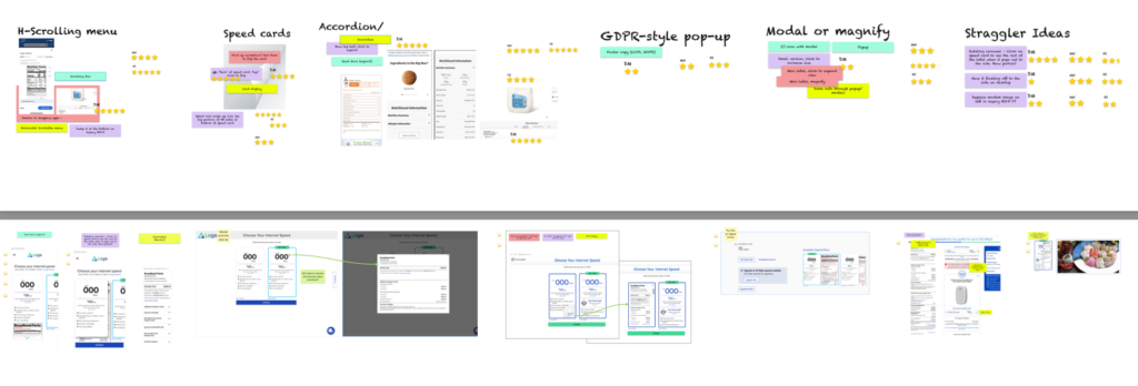
These challenges required innovative approaches and close collaboration across multiple departments to ensure that the solutions not only met federal requirements but also upheld the standards of user experience that customers expect from Lumen Technologies. The next sections will delve into the research and testing methods employed to refine these designs and the process of bringing them into full implementation.
Technical Challenges
Implementing the Broadband Nutrition Label (BBNL) required addressing compatibility issues with CenturyLink’s older, fragmented codebases. To ensure the labels could dynamically adapt to various service offerings and regulatory requirements, the engineering team developed a specialized API. This solution was crafted in collaboration with developer leads, engineering teams, and legal advisors, ensuring that all technical adjustments aligned with the latest compliance and operational standards.
User Research & Testing
In the process of refining the Broadband Nutrition Label (BBNL) designs, I partnered closely with the user research team to evaluate the top three design concepts that emerged from our ideation sessions. Our primary method involved conducting unmoderated user testing using the UserTesting.com platform, which allowed us to gather initial reactions and usage data across a broad demographic spectrum.
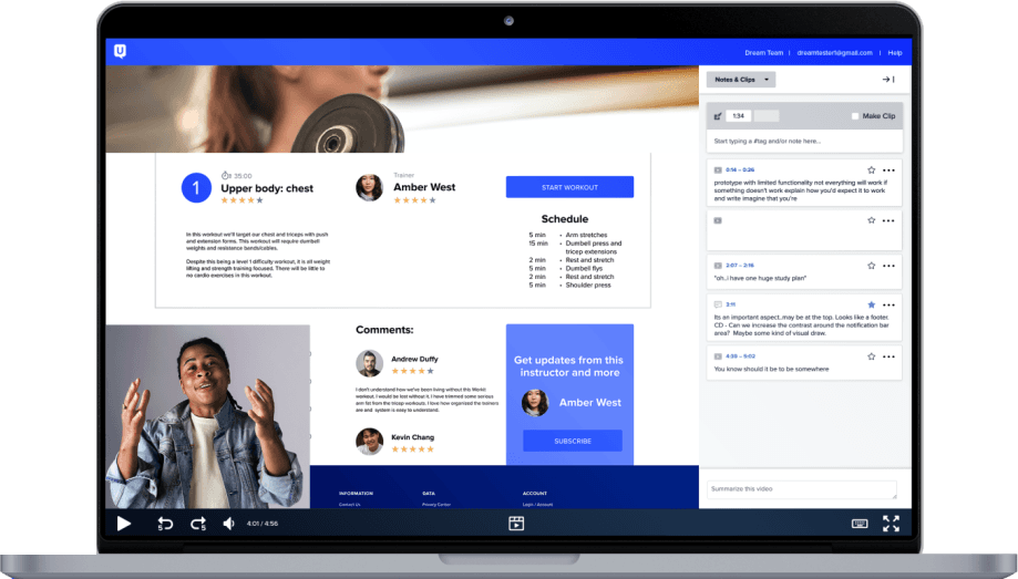
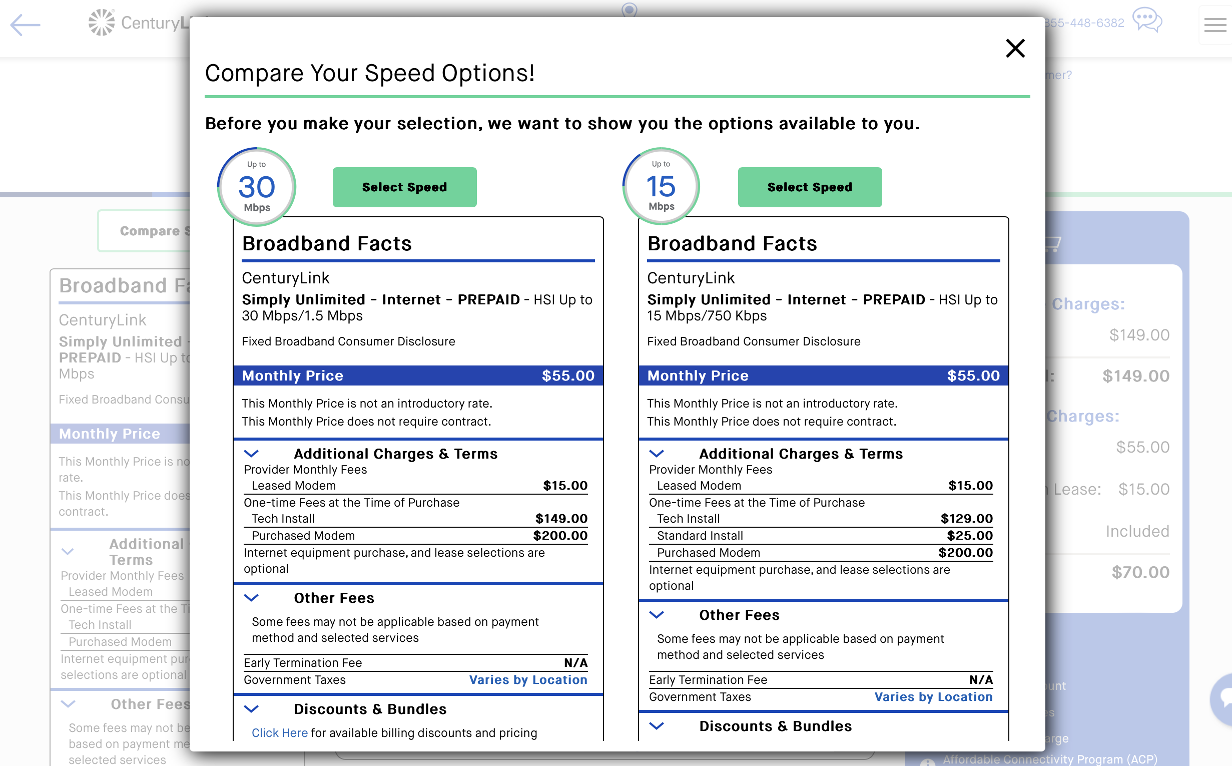
To deepen our understanding of consumer preferences, we followed up with in-person interviews. These interviews were crucial for exploring users’ detailed perceptions and experiences with the labels, particularly why certain elements were favored over others. Unexpectedly, the design featuring a modal pop-up upon page loading received the most positive feedback. Participants noted that this approach felt exceptionally transparent and straightforward, particularly in terms of pricing—key goals of the federal mandate.
Encouraged by the surprisingly positive response to the modal design, we conducted additional in-person interviews with willing participants. These sessions included watching usability test recordings together and conducting short surveys post-session. The consistent preference for the modal design in various testing formats confirmed its effectiveness in meeting the mandate’s objectives while maintaining user satisfaction.
This thorough approach to research and testing was instrumental in validating the final design choice, ensuring that the solution not only complied with federal regulations but also resonated well with consumers, enhancing their experience and trust in the brand.
Design Process
The design process for the Broadband Nutrition Label (BBNL) was highly dynamic, characterized by an iterative approach that integrated real-time feedback from ongoing research and testing. As the senior UX designer, I maintained a close collaboration with the user research team, who provided frequent updates and insights from various testing sessions. This continuous flow of information allowed for swift incorporation of new findings into the design prototypes, such as the adjustability of label sections, timing of label visibility, and overall prominence on the page.
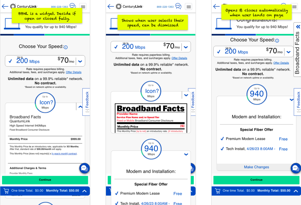
Our rapid prototype development facilitated immediate A/B testing, enabling us to collect and analyze user feedback quickly. This approach ensured that by the end of the research phase, we had a clear understanding of which design was most likely to succeed, with most of the design effectively finalized—requiring only minor refinements.
In parallel, I engaged regularly with the Design System team, ensuring alignment with broader design standards and updating them on our progress. This interaction was crucial for seamlessly integrating new components into the existing system and for adhering to established design principles.
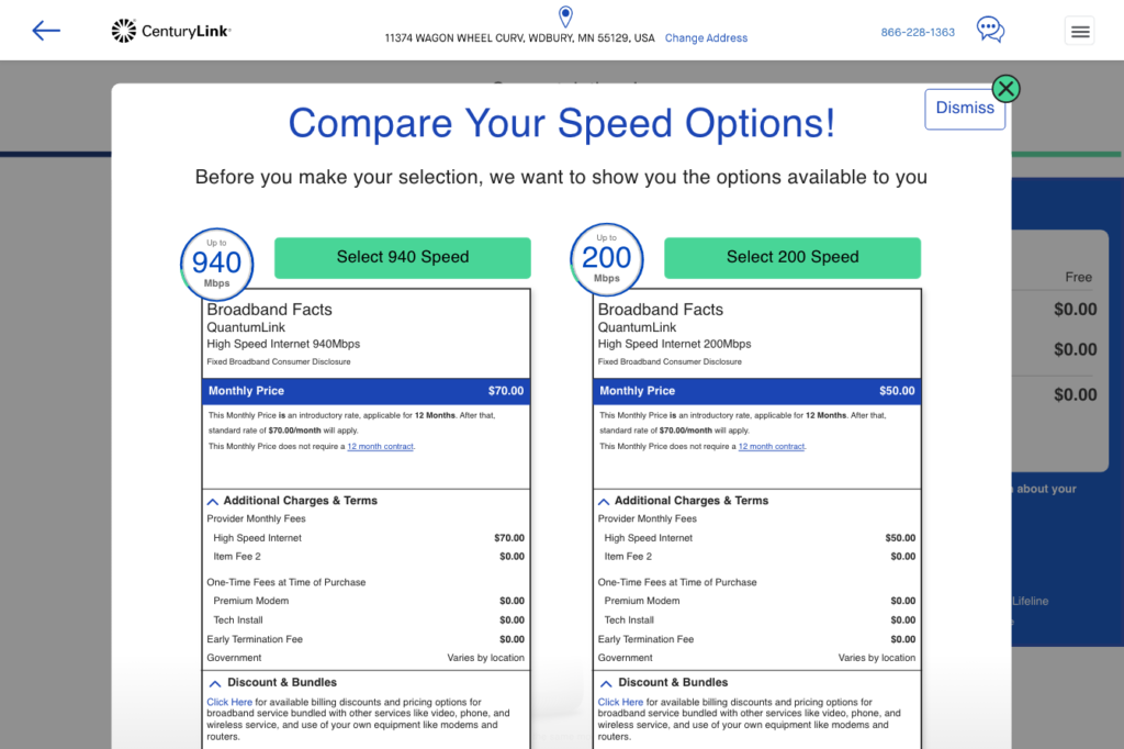
Weekly meetings with stakeholders, including legal advisors and company executives, were integral to the process. These sessions not only kept all parties informed of ongoing developments and changes in FCC regulations but also allowed for the preemptive addressing of potential legal concerns. The feedback from these meetings was instrumental in refining the designs to ensure compliance and stakeholder alignment.
The culmination of this process was a joint presentation with the user research team, where we showcased our findings and the final design. This presentation confirmed the effectiveness of our design choices and prepared all stakeholders for a smooth rollout of the solution.
This proactive and data-driven design approach minimized surprises and maximized efficiency, allowing us to not just design, but to design with precision based on real user data and stakeholder input.
Implementation and UX Support

In an effort to bridge the common gap between design and development, I personally took the initiative to construct the Broadband Nutrition Label using HTML, CSS, and JavaScript, based on our final design specifications. Recognizing a recurring challenge in front-end development capabilities among the dev teams, I built a fully functional prototype. This prototype was not only a tool to ensure fidelity to the design but also served as a practical template for developers at CenturyLink and Quantum Fiber. It included clearly defined class names for each category of the label, tailored to integrate seamlessly with frameworks like React, Vue, and Salesforce.
To further support implementation, I created a variant of the label in Figma, annotated with ‘sticky notes’ that provided explanations for specific functionalities. This annotated prototype aimed to clarify any ambiguities and facilitate a smoother transition from design to development.
Post-handoff, I maintained a proactive engagement with the development teams, checking in bi-weekly during their sprint showcases to monitor progress and offer assistance. I encouraged open communication, urging the dev teams to reach out with any questions or challenges they encountered with the implementation. This approach was driven by my longstanding belief in the importance of ongoing collaboration between UX and development teams to prevent the common pitfall where designs are handed off and not revisited until launch—a practice I observed upon my arrival at Lumen and was determined to change.
Through consistent support and collaboration, I helped to foster a culture of integration between the UX and development teams at Lumen. This initiative not only facilitated the successful rollout of the BBNL but also set a new standard for UX and development collaboration across the company. My efforts were recognized within the organization, leading to an invitation to present these new UX Dev support protocols to the broader UX team and influence their adoption in other projects across the company. This approach has significantly improved the implementation fidelity and overall quality of projects, demonstrating the strategic value of UX in the technological workflow.
Conclusion
The Broadband Nutrition Label (BBNL) project at Lumen Technologies was an expansive and highly collaborative effort that spanned the entire company. As a senior UX designer, I worked closely with a variety of teams across both the CenturyLink and Quantum Fiber brands, including their respective web and app teams. My role also involved significant interactions with multiple legal advisors and C-suite executives, reflecting the project’s importance and high visibility within the company.
Despite the challenges of aligning the project with two different brand ecosystems and meeting rigorous federal mandates, our efforts were focused on creating a transparent and user-friendly implementation. This commitment to transparency was ultimately recognized externally; in March 2024, an article on TechHive graded Lumen’s implementation of the BBNL with an ‘A’, noting it as one of the best among competitors. Many competitors reportedly attempted to obfuscate the label, but Lumen’s implementation was celebrated for adhering to the spirit of the law.
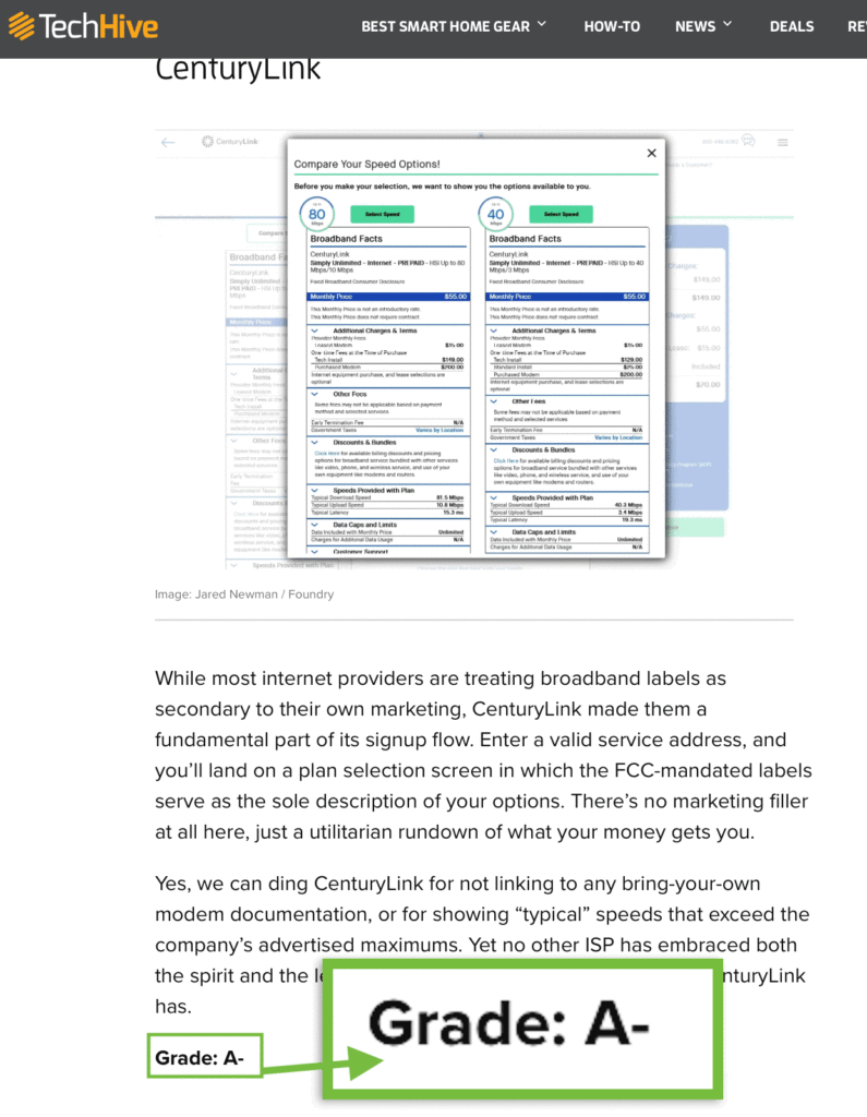
While most internet providers are treating broadband labels as secondary to their own marketing, CenturyLink made them a fundamental part of its signup flow. Enter a valid service address, and you’ll land on a plan selection screen in which the FCC-mandated labels serve as the sole description of your options. There’s no marketing filler at all here, just a utilitarian rundown of what your money gets you.
TechHive
Yes, we can ding CenturyLink for not linking to any bring-your-own modem documentation, or for showing “typical” speeds that exceed the company’s advertised maximums. Yet no other ISP has embraced both the spirit and the letter of the FCC’s rules to the extent that CenturyLink has.
Grade: A-
Final Thoughts
Unfortunately, the entire digital services team, including all UX designers, UX researchers, and the design systems team, was laid off in November 2023. As a result, I was not able to witness the final stages of the rollout or analyze the site metrics post-launch in February 2024. Despite this, the project’s success was evidenced not only by the high external ranking but also by the positive findings from our extensive user research.
This project was not just a design and technical challenge but a significant learning opportunity, demonstrating the profound impact of strategic UX involvement on compliance projects. The recognition of our implementation as one of the best reflects the effectiveness of our design and development approach, setting a benchmark for future projects within the telecom industry.