Background
ROLE: User Experience Designer
TIMELINE: March 2019 – March 2021
TOOLS: Adobe XD, Storybook.js
COMPANY: Quadax
Quadax is a leading medical billing solutions provider serving hospitals, clinics, and healthcare practices across the U.S. In 2019, Quadax’s digital products were expanding rapidly across multiple platforms as they prepared to replace their aging product lines with a newer, unified line called ‘RCO’. Unfortunately, the company lacked a consistent visual language and reusable components, leading to development inefficiencies as engineers reused bits of code used elsewhere. This all lead to having fragmented user experiences as there were many cases where some code was updated elsewhere/more recently, but the person using it doesn’t realize it.
The Problem
Before the design system, Quadax had a host of issues.
- Each product team styled components differently. This was done in part due to having previously separate product lines, but now we were moving towards having a long-term unified product line.
- Developers were rebuilding UI elements from scratch for each project, or were copying previously implemented code that may have had feature updates elsewhere.
- Inconsistent, very dated branding and UI elements confused users and diluted the product identity.
- Design and development handoffs were inefficient and quite error-prone.
All in all, there was no single source of truth for design or front-end patterns.
As Lead UI/UX Designer, I was tasked with establishing a unified design system to improve product consistency, speed up design and development cycles, and elevate the overall user experience.
My Role
- Owned the design system initiative from initial audit to full rollout
- Built and documented the visual language (colors, typography, spacing)
- Created a full component library using Adobe XD and Storybook.js
- Partnered with development teams to align UI patterns to React and Bootstrap frameworks
- Established governance practices to maintain and evolve the system over time
Challenges
- Balancing innovation with legacy system constraints
- Driving adoption among skeptical stakeholders used to “their way” of doing things
- Establishing a governance process without a dedicated design ops team
Process
- Audit and Discovery
- Conducted an inventory of all UI patterns across Quadax’s major products
- Identified redundancies, inconsistencies, and accessibility issues
- Define Core Foundations
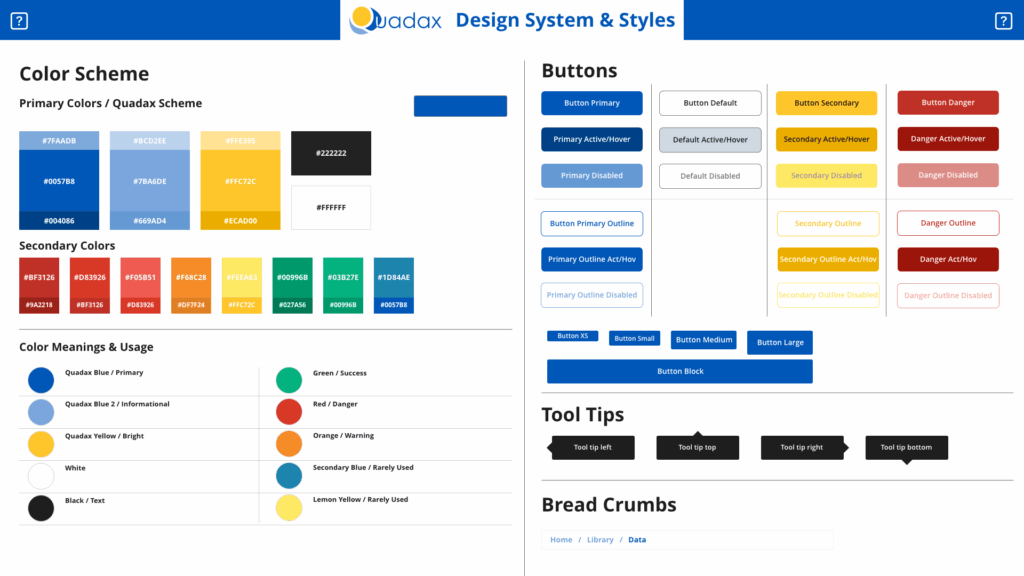
- Created a visual design language: color palette, typography scale, spacing system, elevation rules
- Established base tokens for easy future theming (e.g., dark mode, white labeling)
- Component Design and Documentation
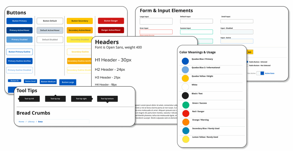
- Designed atomic components: buttons, inputs, modals, cards, form layouts, alerts
- Documented usage guidelines, states (default, hover, active, disabled), and accessibility standards
- Developer Collaboration (Storybook.js)
- Partnered with front-end teams to build coded versions of components in Storybook.js
- Provided ongoing UX reviews to ensure pixel-perfect implementation
- Integrated components into Bootstrap-based frameworks to accelerate product builds
- Launch and Adoption
- Rolled out the design system incrementally across major products
- Held workshops and training sessions with product teams
- Created templates and starter kits for both design and development teams
System Overview
The Quadax Design System was built to support the unique demands of medical billing software — where interfaces are often dense with complex, multi-layered data. Our system prioritized clarity, hierarchy, and consistency, enabling both novice and expert users to quickly scan, interpret, and act on eligibility, claims, and benefits information.
Key Focus Areas:
🔷 Tables & Grids
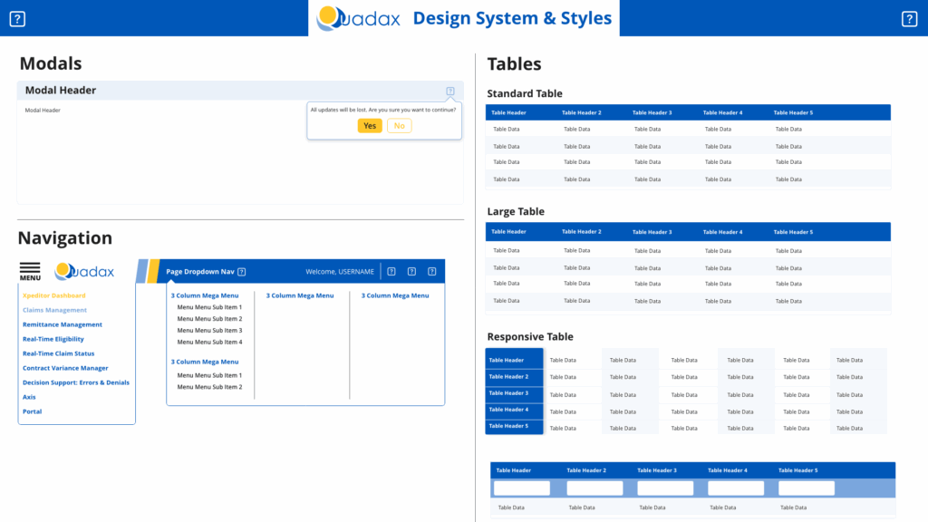
The heart of the Quadax UI consisted of a lot of tabular data. We developed a scalable table system supporting multiple sizes (standard, large, responsive), zebra striping for scanability, and standardized padding for tight but readable layouts. Tables were designed to support nested content, pagination, column sorting, and contextual actions — all within limited screen real estate.
Eventually, these custom tables were replaced with AG Grid though, as it was far more rebust and flexible than what we could custom develop.
🔷 Typography & Spacing
To handle information density without overwhelming users, we introduced a clean typographic hierarchy with consistent sizing, weights, and spacing tokens. This enabled efficient content stacking and minimized visual clutter — crucial for showing provider details, plan data, and service-level information.
🔷 Form & Input Elements
A comprehensive set of form controls was designed to meet healthcare-specific needs — including dropdowns, searchable fields, segmented controls, and validation states. These components were accessible, mobile-friendly, and consistent across use cases like patient lookup, plan eligibility checks, and provider search.
🔷 Alerts, Tooltips & Feedback
Error states, warnings, and success confirmations followed a uniform visual language based on semantic color usage (e.g., red for denial, green for eligibility). Tooltips were added to aid understanding without increasing cognitive load, especially for fields using insurance or CMS-specific terminology.
🔷 Component Library & Theming
The full component library — including buttons, breadcrumbs, modals, and nav structures — was developed in Adobe XD, then implemented in Storybook.js. We also accounted for future theme adaptability (e.g., white labeling or accessibility adjustments) via tokenized design variables.
Storybook Integration – Wins & Lessons
Integrating Storybook.js into the Quadax design system was both one of the most rewarding and challenging aspects of the project.
🔧 Implementation & Advocacy
At the time, Storybook wasn’t as robust as it is today — and getting engineering buy-in was a consistent hurdle. Product teams often viewed design system work as a drain on their sprints, so I had to:
- Advocate cross-functionally for long-term system value
- Negotiate sprint points for system work
- Educate teams on the efficiency gains of centralized components
Despite resistance, I collaborated with dev leads to build out core components in Storybook and pushed for consistent adoption across products.

📚 Documentation Challenges
One major limitation was that Storybook documentation had to be coded manually — meaning updates were sporadic and reliant on dev time. We couldn’t yet tie in tools like ZeroHeight, so there was a disconnect between design usage guidance (in Confluence) and live components (in Storybook).
This friction directly shaped how I approach documentation in later systems — preferring tools like ZeroHeight and Figma-connected systems that empower designers to own the documentation layer.
✅ Wins
Despite those challenges, Storybook became a powerful asset:
- Teams could see components live in context, reducing guesswork
- Code snippets were easily accessible for quick implementation
- It laid the groundwork for more consistent front-end engineering across products
📘 What I Learned
This experience was foundational to how I now approach system tooling:
System maturity depends as much on team alignment as it does on technology
Storybook isn’t just a dev tool — it’s a communication bridge
Buy-in is a process that starts with education and early wins
Outcomes
- Increased design and dev velocity:
New feature designs were 30–40% faster after the system rollout. - Consistency across products:
Unified branding improved user trust and product coherence. - Reduced technical debt:
Developers reused system components instead of recreating UI from scratch, reducing bugs and maintenance work. - Stronger UX culture:
The design system created a shared language between design, product, and engineering teams.
What I’d Do Differently – 6 Years Later
Looking back, the Quadax design system was a major step forward for the organization, but there are several things I’d now approach differently:
Centralized Documentation:
At the time, usage guidelines and component specs lived in Confluence, which made updates cumbersome and discoverability difficult. Today, I’d use a purpose-built documentation tool like ZeroHeight, integrated with Figma or Adobe XD, so designers and developers always have a live source of truth.
Stronger Design–Dev Sync:
Our Storybook integration was a solid start, but not tightly coupled with the design tool. I’d now focus on tighter alignment between the coded components in Storybook and the source designs in Figma, ensuring seamless design-to-dev handoff and eliminating guesswork.
Governance Model:
We lacked a clear governance structure for maintaining and evolving the system. I’d now establish a regular cadence for audits, backlog grooming, and system updates — ideally supported by a design ops or design system squad.
- Component Analytics:
We didn’t have visibility into which components were being used (or ignored). If I were doing it again, I’d implement usage tracking or telemetry to guide prioritization and maintenance efforts. - Accessibility-First Foundations:
While we adhered to basic accessibility principles (contrast, focus states), I’d now start with an accessibility-first approach — baking in WCAG 2.1 AA standards at the token and component level from day one.
This project taught me how to build and scale a design system — and also what it takes to make one adoptable, maintainable, and loved.
Reflection
Building the Quadax design system reinforced my belief that design systems are living products, not one-time deliverables.
Successful systems require:
- Strong collaboration between design and development
- Clear, accessible documentation
- Ongoing iteration based on feedback and new product needs
This project laid the foundation for future UX maturity at Quadax and strengthened my skills in systems thinking, team alignment, and scalable design practices.